Sellics Perpetua Benchmarker: The Ultimate Tool for Amazon Sellers

-
Sellics Perpetua Benchmarker: The Re-Invention Of Performance Marketing
- What is the Perpetua aka Sellics Benchmarker Tool?
- How Does it Work?
- What are the Key Features of the Benchmarker Tool?
- Summary
- Performance Matrix
- Impact Drivers
- Product Analysis
- Account Structure
- Ad Formats
- Empower Your Amazon Advertising Strategy: Take Action with Benchmarker
- Final Thoughts
Disclosure: Hi! It's Vova :) Some of the links in this article may be affiliate links. I get a commission if you purchase after clicking on the link, this does not cost you more money, and many times I can even get a nice discount for you. This helps me keep the content free forever. For you. Thank you! :)
Sellics Perpetua Benchmarker: The Re-Invention Of Performance Marketing
Are you an Amazon seller who wants to know how your PPC (Pay-Per-Click) ads compare to your competitors'?
Well, Sellics Benchmarker is the tool you need!
In this article, I'll walk you through a tutorial on this tool that provides an in-depth analysis of your PPC ads on Amazon.
It's based on one of my recent videos where I was joined by Thomas Ropel, the Chief Marketing Officer at Sellics, who gave a detailed overview of the Benchmarker's features.
But hey folks, if you're into Amazon sales analytics, you might have heard that Sellics has been acquired by Perpetua.
This means that the Sellics Benchmarker tool is now under Perpetua's management.
Since the video was recorded in the past, we referred to Benchmarker as Sellics' tool.
However, all the features we discussed remain the same, with some additional functionalities that I have explained in detail in this article.
If you prefer watching over reading, there is a tutorial embedded below.
On the other hand, if you enjoy reading, this article has got you covered.
So sit back, relax, and enjoy! :)
What is the Perpetua aka Sellics Benchmarker Tool?
The Benchmarker is a tool designed to help Amazon sellers and vendors analyze the competition and identify profitable product opportunities.
It helps with Amazon PPC, SEO, profit calculations, and much more.
You can also use it to benchmark your PPC ads against your competitors' ads, giving you insight into your performance compared to theirs.
In other words, the Benchmarker tool will let you know where you're doing well and where you're not doing so well in comparison.
How Does it Work?
To get started, you need to sign up to the platform.
Perpetua isn't free but I have a special affiliate link that will allow you to use it for 100% free.
Click here to obtain it now!
To get started, simply click on one of the links and select the Benchmarker tab.
Then, hit the "Analyze your products now" button and enter your email address and password. It's like boarding a train - fast and easy. 😉
Next, choose your marketplace and hook up your Amazon seller or vendor account to the Benchmarker.
This will be done by connecting your API with the tool.
The connection will enable Sllics Benchmarker to access your data.
Once you're onboard, you will receive a comprehensive performance report within 24 hours, detailing your ad metrics.
The report will include a comparison of your performance data with the insights generated by Perpetua's data science team.
The team analyzes data from $2.5 billion worth of ad revenue from the previous year to provide you with accurate and reliable benchmarks.
With this report, you will be able to track your ad performance over time and make informed decisions to optimize your campaigns.
Please take note that the Benchmarker tool analyzes your last month's performance every 30 days.
Essentially, you receive the latest report on the same day of the month that you originally signed up.
Once you have received more than one report, you can navigate to previous reports as well.
What are the Key Features of the Benchmarker Tool?
When you receive your report, you'll notice that there are several sections, each with its own set of features.
Let's take a look at them.
Summary
Report Scope
One of the standout features of Benchmarker is its Report Scope.
Located next to the "View Certificate" button in the top-right corner of your screen, the Report Scope tab provides valuable insights into your ad performance.
By using this feature, you can quickly and easily see how your ads are performing on a monthly basis, and receive a performance badge to help assess your progress.
Essentially, there are four types of badges – Platinum, Gold, Silver, and Bronze.
If you receive a Platinum badge, it means that you're in the top 10% of performers.
A Gold badge means you're in the top 20%, while a Sliver badge means you're in the top 50%.
If you receive a Bronze badge, it means you're in the bottom 50% and that there's plenty of room for improvement.
You can also toggle between different months to view historical performance data and identify trends over time.
This allows you to make informed decisions about optimizing your campaigns to drive better results.
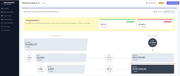
Growth Potential Analysis
Scrolling down, you'll find two distinct options to explore your ad performance.
The first option allows you to compare your ad metrics against industry benchmarks.
This feature provides a clear overview of how your ads are performing relative to your competitors, enabling you to identify areas for improvement and stay ahead of the curve.
The second option allows you to perform a month-over-month comparison of your ad performance.
This feature provides valuable insights into how your ad metrics have changed over time, allowing you to identify trends and make data-driven decisions to improve your campaigns.
Both options display your performance data through two essential metrics - conversion rate (CVR) and click-through rate (CTR), giving you a comprehensive understanding of your ad performance.
You can easily toggle between these two options to get a complete overview of your ad performance and optimize your campaigns accordingly.
Performance Funnel
In addition to the CVR and CTR metrics, the Summary section also provides a detailed Performance Funnel dashboard to help you understand how your ad campaigns are performing at each stage of the customer journey.
The Performance Funnel breaks down your performance data into three key stages - Impressions, Clicks, and Orders.
This information is calculated using CTR and CVR and it allows you to identify any potential bottlenecks or drop-offs in the funnel.
With this information, you can optimize your campaigns to improve your conversion rates and ultimately drive more sales.
Return on Investment (ROI)
Another important metric in the Benchmarker tool is Return on Investment (ROI).
The tool calculates your ROI by analyzing your ad spend and revenue generated from ad sales.
Specifically, Benchmarker calculates your Average Cost of Sales (ACoS) based on your Cost Per Click (CPC) and uses this information to calculate your ad spend.
It then calculates your ad sales based on your Average Order Value (AOV).
With this data in hand, you can accurately measure the effectiveness of your ad campaigns and identify which campaigns are providing the best return on investment.
Ultimately, you can make informed, data-driven decisions to optimize your ad spending and maximize your revenue.
Basically, there are ten metrics involved in all this calculation.
It might seem a lot but think of it like a recipe, where each ingredient adds to the final dish!
So, let's get cooking and take a quick look at each of them.
Impressions – The number of times your ad was shown to users.
Click-through Rate – The percentage of people who clicked on your ad after seeing it.
Clicks – The total number of clicks your ad received.
Conversion Rate – The percentage of users who completed a desired action after clicking on your ad.
Orders – The number of orders placed as a result of your ad campaign.
Cost Per Click – How much you paid for each click on your ad.
Average Order Value – The average value of each order placed through your ad campaign.
Average Cost of Sales – The average amount you spent on advertising for each sale generated.
Ad Spend – The total amount spent on your ad campaign.
Ad Sales – The total revenue generated from your ad campaign.
While all the metrics in the Benchmarker tool are important, some play a more significant role in evaluating the effectiveness of your ad campaigns.
These metrics are the Click-Through Rate (CTR), Conversion Rate (CVR), Cost Per Click (CPC), Average Order Value (AOV), and Average Cost of Sales (ACoS).
Performance Matrix
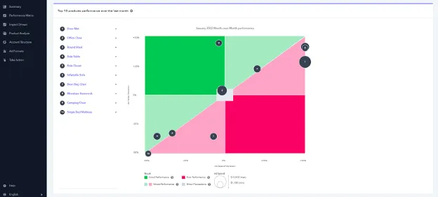
The Benchmarker tool's Performance Matrix section provides an in-depth analysis of your top 10 products' performance over the last month.
It's a great way to stay on top of your products' performance, identifying what's working and what's not.
In addition to the product-specific performance data, the section includes a graph that tracks the month-over-month performance based on ad sales and ad spends variations.
The graph displays the performance results of each product in a different color, with green indicating good performance, light green and light red indicating mixed performance, red indicating poor performance, and gray indicating minor fluctuations.
This graph provides a clear visual representation of your product's performance trends over time.
By analyzing the data, you can identify the areas where you need to focus your efforts to improve your product's performance.
For instance, if you see a consistent trend of poor performance in a product, you may need to adjust your ad spend or consider improving your product listing.
On the other hand, if you see a positive trend in the performance of a product, you may want to increase your ad spend and capitalize on the opportunity to drive more sales.
Impact Drivers
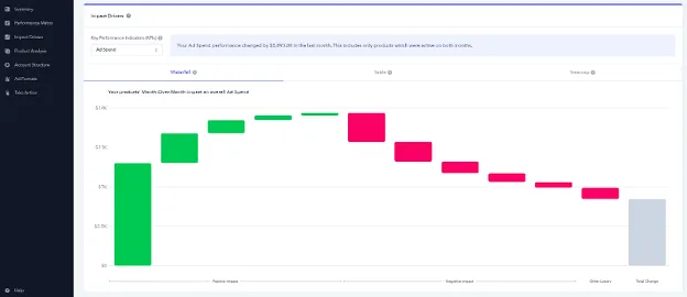
The Benchmarker tool's Impact Drivers feature provides valuable insights into the performance of your products and how they impact critical KPIs such as Ad Spend, Ad Sales, Impressions, Orders, and Clicks.
This feature helps you to quickly identify the products that are driving the most impact on your ad campaigns, allowing you to focus your efforts on improving their performance and ultimately increasing your revenue.
The Impact Drivers feature presents your product's performance data in three different charts: Waterfall, Table, and Treemap.
The Waterfall chart displays a Month-Over-Month comparison of your products' impact on the selected KPI.
The chart shows which products are contributing to the increase or decrease of the selected KPI, allowing you to identify the top-performing and underperforming products.
The Treemap chart, on the other hand, is a visual representation of your product's performance data.
It displays your products as blocks of varying sizes, with the size of each block corresponding to the value of the KPI for that product.
Both of these charts use color coding to display your product's performance based on the selected KPI, making it easy to quickly identify top performers and underperformers.
The Table chart displays a tabular representation of your product's performance data sorted by the selected KPI. It allows you to quickly compare your product's performance and identify the top performers and underperformers.
The Table chart is especially useful when you want to dive deeper into your product performance data and analyze it from different angles.
It's because you can add filters and rules to your data, making it easier to analyze your products' performance.
For example, you can filter your data by specific products, time periods, or KPIs to analyze specific aspects of your performance.
Additionally, you can set rules that highlight specific data points, such as products that have exceeded a certain threshold or those that are underperforming.
The ability to add filters and rules to your data provides a lot of flexibility and customization options, allowing you to tailor your analysis to meet your specific needs.
By doing so, you can easily identify patterns and trends in your product performance and take the necessary steps to optimize your campaigns and maximize your ROI.
Product Analysis
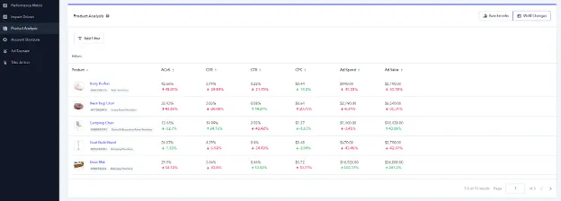
Another great feature of the Benchmarker tool is the Product Analysis section, which offers sellers a comprehensive analysis of their top 100 advertised products with at least one impression.
This section is particularly useful for those who are looking to optimize their ad campaigns and maximize their revenue.
The tool starts by analyzing the four major KPIs, including ACoS, CPC, CTR, and CVR, and compares them to the appropriate benchmark.
If a product is outperforming the benchmark (top 40%), it is displayed in green, indicating that the product is performing well.
If there is room for improvement, it is displayed in red.
And, if the product's performance is about average, it is displayed in yellow.
In addition to the analysis of the four major KPIs, the Product Analysis section also provides a month-over-month performance analysis when a report for the previous month is available.
This analysis allows sellers to track the progress of their products over time and identify areas for improvement.
Account Structure
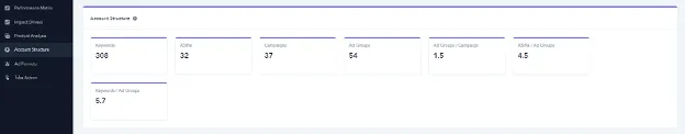
The Account Structure section of the Benchmarker tool is a valuable resource for understanding the unique structure of your advertising account.
As each account has specific objectives, it is crucial to understand the amount of keywords you use, your product ASINs, campaigns, ad groups, ad groups/campaign, ASINs/ad groups, and keywords/ad groups.
This section is organized into different tabs, each representing a specific area of your account's structure.
These tabs provide an overview of your account's performance and highlight areas for potential optimization.
For instance, the keywords/ad groups tab displays the number of keywords in each ad group, allowing you to determine whether your ad groups are structured effectively.
Similarly, the ASINs/ad groups tab displays the number of ASINs in each ad group, allowing you to determine whether your ad groups are focused on specific product categories.
By analyzing the data in the Account Structure section, you can identify areas for improvement and optimize your account structure for better performance.
Ad Formats
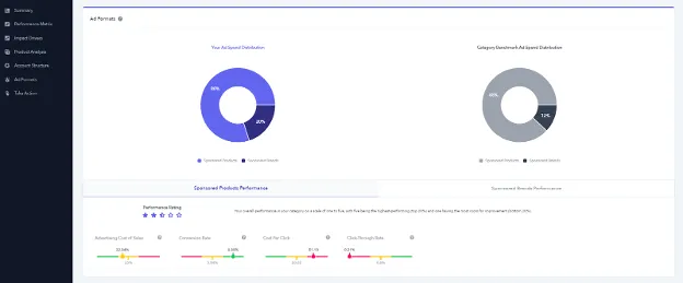
Ad Formats is a crucial section of the Benchmarker tool that helps you analyze your ad spend distribution and performance in category benchmarks for sponsored products and sponsored brands.
The section provides two pie charts that offer a quick snapshot of your ad spend distribution across various ad formats.
One pie chart shows the distribution of your ad spend across Sponsored Product formats, while the other displays the distribution of your ad spend across Sponsored Brand formats.
Ad Formats also allows you to track the performance of your ad formats in terms of rating, ACoS, CVR, CTR, and CPC.
The tool uses color codes to display the performance of your ad formats against appropriate category benchmarks.
By analyzing the performance of your ad formats in the Ad Formats section, you can gain valuable insights into which formats are delivering the best results and where you need to make improvements.
This information can help you optimize your ad spend and maximize your revenue.
Empower Your Amazon Advertising Strategy: Take Action with Benchmarker
The Benchmarker doesn't just provide performance metrics and analysis.
It also offers tools to help you take action and optimize your Amazon Advertising strategy.
With features like automated bidding and keyword management, you can streamline your advertising efforts and improve your overall performance.
And if you need guidance or have questions, Perpetua's team is always available to chat and offer advice.
Plus, you can even earn rewards by referring other Amazon sellers to Benchmarker.
It's a win-win situation: they'll benefit from the insights and you'll earn $100 for each referral.
So don't just settle for analyzing your advertising data - take action and use the Benchmarker to take your Amazon business to the next level.
Final Thoughts
The Pepetua Benchmarker – formerly Sellics Benchmarker – tool is a game-changer for Amazon sellers who want to analyze the competition and identify profitable product opportunities.
The tool provides an in-depth analysis of PPC ads on Amazon and helps you benchmark your ads against your competitors'.
With Benchmarker, you can receive comprehensive performance reports, identify areas for improvement, and optimize your campaigns accordingly.
Additionally, the tool offers valuable insights into how your ad metrics have changed over time, allowing you to make data-driven decisions to improve your campaigns.
All in all, Benchmarker is an essential tool for anyone looking to succeed in the highly competitive Amazon marketplace.
And with that, we come to the end of this post.
Until we meet again…
Yours,
Vova :)
-
Sellics Perpetua Benchmarker: The Re-Invention Of Performance Marketing
- What is the Perpetua aka Sellics Benchmarker Tool?
- How Does it Work?
- What are the Key Features of the Benchmarker Tool?
- Summary
- Performance Matrix
- Impact Drivers
- Product Analysis
- Account Structure
- Ad Formats
- Empower Your Amazon Advertising Strategy: Take Action with Benchmarker
- Final Thoughts
Disclosure: Hi! It's Vova :) Some of the links in this article may be affiliate links. I get a commission if you purchase after clicking on the link, this does not cost you more money, and many times I can even get a nice discount for you. This helps me keep the content free forever. For you. Thank you! :)