Helium 10 Sales Graph Review & Tutorial – A Must-Read For Amazon Sellers
-
Helium 10 Sales Graph Review And Tutorial – A Must-Read For Amazon Sellers
- 🔊 InterestingHelium10 Offers 🔊
- Helium 10 Sales Graph - Detailed Tutorial And Review
- Sales Chart
- Sales
- Trend Line
- 7-day Moving Average
- Graph Reading
- The Bottom Line
Disclosure: Hi! It's Vova :) Some of the links in this article may be affiliate links. I get a commission if you purchase after clicking on the link, this does not cost you more money, and many times I can even get a nice discount for you. This helps me keep the content free forever. For you. Thank you! :)
Helium 10 Sales Graph Review And Tutorial – A Must-Read For Amazon Sellers
Hey there! Ready to unlock the power of Helium 10 Sales Graph and take your Amazon business to the next level?
A wholehearted welcome!!!
My name is Vova Even, and I am an active seller on Amazon; been in the trade game since 2016.
I’m still on the front, here to share some valuable advice and secrets you need to level up on Amazon.
My ultimate goal is to assist novice and advanced Amazon FBA sellers to increase their earnings and save while maintaining a steady growth rate.
Check out my blog, YouTube, or Udemy channels.
You’ll discover a bunch of tutorials, tips, tricks, and hacks – just everything it takes to win on Amazon.
In today’s blog, I will walk you through the nitty-gritty of Helium 10 Sales Graph (part of the Helium 10 browser extension) to kickstart your success on Amazon.
If I break it down, I will explain how to use it for Amazon Product research, find profitable products, avoid bad products, understand seasonality, look out for the peak sales season, etc.
If you’re here today, chances are that you wish to get the knack of Helium10 Sales Graph to excel on Amazon.
At this point, it’s all natural for your mind to feel all over the place - and you’re definitely not alone! So, let’s dive right in!
However, if you don’t feel like reading it all, here’s my detailed YouTube tutorial to serve you:
🔊 Interesting Helium 10 Offers 🔊
Get Helium 10 Chrome Extension For Free
Wish you could get the Helium 10 Chrome extension for free?
If yes, you’re in for a treat because this Helium 10 extension download link will take you to the landing page where you can download the Helium 10 Chrome extension - that, too, is completely free!
Get Free Helium 10 Trial & Discounts
In for another fantastic news?
Just a click on this Helium 10 free trial link will lead you to another landing page where you can get a free Helium 10 account with a free trial, and discounts.
Plus, you can get Helium 10 discount coupon codes to save big on Helium 10 discounts like VOVA6M20 gives you 20% off on your first 6 months on Helium 10.
Also, VOVA10 gets you 10% off recurring every month on Helium 10.
These are great for the monthly and the yearly plans, and they work on the Platinum, Diamond, and A La Carte plans.

Helium 10 Sales Graph - Detailed Tutorial And Review
First, you need the Helium 10 Chrome Extension for a detailed view of the Sales Graph.
Once you’re on a specific product page on Amazon, all you need to do is click on the logo in the upper right corner of the Chrome browser.
It’ll take a few seconds to load before you’re all set to understand the crux of the given product’s sales.
On the Helium 10 Extension pop-up, click on X-ray — Amazon Product Research.
That pulls out all the data from the specific ASIN, leading you to the sales graph. Initially, you can only observe it with a bird’s eye view.

To get more details, you need to click on it to get to the bigger picture.
Sales Chart
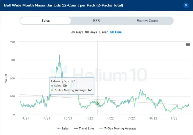
First up, we see the time on top. By the way, the product is a jar lid. The one you use to seal a jar.
You may go back 30 days, 90 days, a year, or even All Time, which generally takes you two years back.
Of course, only if the ASIN has a history of over two years. Let’s say today is the 7th of March.
Clicking on “All Time” will take you to the 7th of March, exactly two years ago.
On the left side of the graph, we can see the Values, which in this case are sales values; however, it depends on the product.
If we were to talk about the product in the picture, we can see it reached about 340 sales towards the end of the graph.
Yep, that’s precisely why the graph ends at 340 sales. On the lower part of the graph are the dates.
Next, you can download CSV, XLS, PNG, and JPEG on the top right.
You may download the graph as an image by sending it to your virtual assistant, friend, partner, or even to the group of Amazon sellers that you’re a part of.
This way, you even get to ask them for their opinions.
Below the dates, we have the Sales, Trend Line, and the 7-day Moving Average.
Since many sellers get stuck here, let’s go through each one of them one at a time.
Sales
As you might have guessed, the Sales give you the approximate amount of the product’s sales at a given time.
If we move the cursor along the graph, we’ll see different sales values at different points in time.
If you’re curious why the sales graph is beneficial, that’s not a tough nut to crack.
It lets you understand how the product of interest is performing in the market.

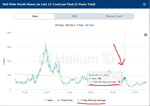
Trend Line
Next to the sales, we have the trend line, which is as fascinating as it sounds!
The picture below shows the daily sales trend line average for two years.
If we look closely, it’s quite easy to tell that the average daily sales two years ago were about 110, whereas now it has fallen to 50.
Yep, in the span of two years, the trend line just went down!
Plus, if you see the sales and trend line, the difference becomes clearer than ever.
Or, you may simply remove the sales to observe the trend line alone, if that works better for you.

7-day Moving Average
Onto the 7-day moving average (the green-colored line), it’s normal to wonder why that’s needed in the first place.
While it pretty much matches the sales, it’s different at times. Essentially, it divides the combined sales of the last seven days by seven.
Suppose the daily average sales of a week are 700, so this moving average divides this number by 7, only to get the daily moving average.
Which is 100.
That sounds pretty helpful, right?
With the sales going up one day and down the other day, it gets overwhelming to understand.
However, the seven-day moving average makes it quite a breeze and helps us understand the recent trend better.
Graph Reading
First, we have the All Time graph.
I will use the example from the video that I've shared. We'll talk about a kitchen knife here.
This one gives you a glimpse into the future of the product.
For instance, if you wish to compete in a specific niche, you can see the main sellers and, of course, the best seller.
Or, you may randomly pick a product to find its trend, determine the trend of individual products, and even the trend of any keyword.
Moreover, it can help understand the trend of the given product itself.
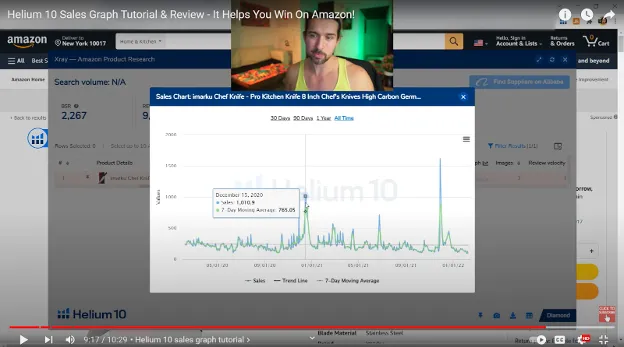
As you can see in the graph above, this product has been selling quite well throughout the years.
However, the trend is the same. Slightly going down, if you zoom, you'll see.
Sometimes, the trend line might not be good - at all!
For instance, we take a fidget spinner that used to sell super well and then died off (as happened in 2017). These days the fidget niche is somewhat back to life..
So, seeing the trend going down will tell us a lot about the product.
On the flip side, the trend line for the product above, i.e., the kitchen knife, is pretty good.
We can see that the product has gotten, on average, 20 sales lower, perhaps because more competition got inside or the competitors got more reviews.
Further, the All-time graph will help us understand the history of ASIN and even tell us where ASIN is going.
Let’s say you try to plug yourself into a niche where everyone’s going down.
This will probably tell you what to expect in your niche of interest!
You might as well see different seasons within the All-time graph.
Precisely, you can take a look at seasonality based on two years.
For instance, we can see spikes in the graph for this given product, right?
What do these mean?
Simply put, these spikes mean there are more sales.
While you move your cursor along the spikes, you can see the dates of the peaks and, obviously, the sales.
And one thing’s quite obvious – these peaks are associated with events like Black Friday, Mother’s Day, Prime Day, and many more.
You may figure that out on your own by looking at the dates!
Goes without saying that determining the seasonality will easily help you figure out the giftability of the product too!
Here, you can also see that after the 21st of December, the sales went down.
Well, that’s evidently because things get quieter right after Christmas.
Additionally, you can determine the seasons, i.e., the sales during winters and summers.
For example, a Santa hat will go sky-high in sales during the winter at Christmas and will drastically fall in the summer.
And for the best part, you don’t just get to see it for one year’s Christmas, but for two years!
Take my word for it, it's going to be insanely helpful.
Having said that, you can comfortably make your purchase decisions.
And, of course, find some of the best products using the graphs.
Just to add, in case you want to find better products, you better avoid seasonality.
If you’re unsure whether the product is seasonal, look for huge spikes during seasons – those are the niches you probably don’t want to get in!
Alternatively, if the trend line goes up for a few products in your chosen niche, that’s nothing short of a silver bullet for you!
The Bottom Line
So, that’s a wrap for the Helium 10 Sales Graph tutorial.
This has many benefits to let you ace the trade game on Amazon.
You need to comprehend them well, and you’re all set to conquer the market!

Also, please don’t hesitate to reach out if you have any additional questions or concerns after reading this.
I’ll be at your disposal right away.
Happy Selling!
Yours,
Vova :)
P.S. - I'd recommend you check my full A to Z tutorial of all the Helium 10 instruments.
-
Helium 10 Sales Graph Review And Tutorial – A Must-Read For Amazon Sellers
- 🔊 InterestingHelium10 Offers 🔊
- Helium 10 Sales Graph - Detailed Tutorial And Review
- Sales Chart
- Sales
- Trend Line
- 7-day Moving Average
- Graph Reading
- The Bottom Line
Disclosure: Hi! It's Vova :) Some of the links in this article may be affiliate links. I get a commission if you purchase after clicking on the link, this does not cost you more money, and many times I can even get a nice discount for you. This helps me keep the content free forever. For you. Thank you! :)